MAZDA REINVENTING ITS IDENTITY FOR THE 3RD TIME THIS CENTURY
Designs for a new Mazda logo have appeared on the Japanese trademark site Chizai-Watch. The trademark, filed on July 22, was discovered by AutoGuide and shows a subtly refined evolution of the existing Mazda wings logo with less texture and sharper lines than the existing design. While the current badge looks like it was carved from metal, the new design is one-dimensional with no sculptural texture, following the trends of other automakers like Volkswagen, who have refined their corporate identities to create a cleaner, more modern feel. Including the very first logo of the company that eventually became Mazda, this is the 16th iteration of the Japanese automaker's branding.
Mazda
Mazda is a Japanese automaker founded in 1920 as the Toyo Cork Kogyo Co and only started producing vehicles in 1931 when it made the Mazda-Go auto rickshaw. The Japanese automaker's first official car arrived in May 1960 when the Mazda R360 launched, starting Mazda as we know it today, although the Mazda name was only adopted in 1984. Mazda has a rich history in motorsport, including the honor of being the only manufacturer to win the 24 Hours of Le Mans with a car not powered by a reciprocating engine.
Haven't We Seen This Before Somewhere?
If the newly trademarked design looks familiar, you're not imagining things. Invert the logo and it looks a lot like the Infiniti symbol, but let's gloss over that. Earlier this year, Mazda revealed two concepts, the EZ-6 and the Arata; the former an electric sedan and the latter a preview of what an electrified CX-30 could look and feel like. Both concepts wore a simplified illuminated logo that looked very similar to the one just trademarked in Japan.
The Real Reason Automakers Keep Reinventing Their Logos
Various automakers have updated their logos recently. While some changes are subtle, others have been radically redesigned to signal a brand in flux.
Add CarBuzz to your Google News feed.
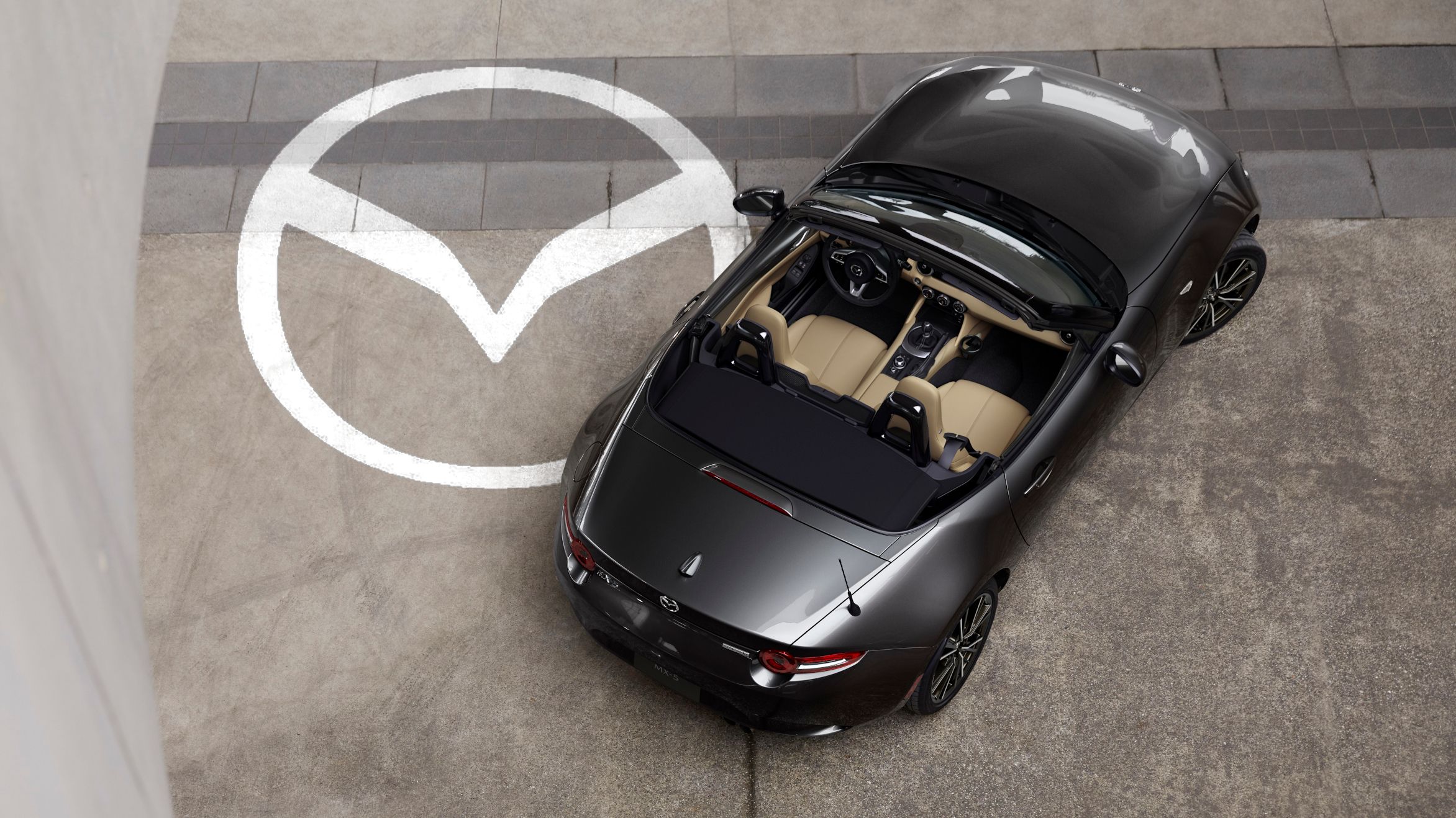
There has been some speculation that this new logo could arrive on a new version of the MX-5 as the Miata celebrates its 35th anniversary this year. The special edition is definitely coming, but Mazda has not confirmed this new brand identity. We suspect that a more likely application is something electric, and when the Arata was revealed, Mazda promised it was more than a concept, with a production-ready version to be presented by the end of 2025.
Change Is The Name Of The Game
Automakers are always exploring ways of reaching new customers through clever marketing, and brand identity is an important part of this. By adopting a simple but sleek logo, particularly an illuminated one, automakers can clearly signal to buyers that they are tech-savvy and ready for whatever the future holds. Even Bugatti feels the pressure to get with the times, and other established premium automakers like BMW have updated their identities frequently, but Mazda has revised its identity more times than most. Mazda was first registered as the Toyo Cork Kogyo Company in 1920, but its name only officially changed to Mazda in 1984, although it had been selling cars under the name for decades. As its objectives and industrial partners changed, so did its brand, and this is just the latest update as electrification becomes ever more important.
Automotive Logos That Have Stood The Test Of Time
Some manufacturers change their brand identities seemingly every week, but these are the logos that went unchanged for the longest periods of time.
A brief history of the Mazda logo
Mazda's first logo from 1920 lasted eight years, but its second only stuck around for three. In 1931, when Mazda was closely affiliated with Mitsubishi, the Mazda name became part of the corporate identity for the first time. The logo lost the Mitsubishi element of its design in 1934 and was lightly refined as a wordmark over the following two decades before a new logo made up of three M-shaped waves arrived in 1936. A secondary logo was invented in 1951, and in 1954, the second major redesign of the Mazda wordmark appeared. Like its predecessor, this stuck around for two decades. Four years after its introduction, a new logo joined the wordmark until 1975, when both were heavily revised. That wordmark has lived on until today, but the logo it was accompanied by was revised again in 1992 before the wings we know today appeared in 1996, being refined in 2015 and carrying on unchanged until a subtle update in 2018.
2024-07-23T22:15:52Z dg43tfdfdgfdSource: Chizai-Watch via AutoGuide